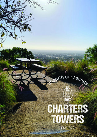
 The Tourism Destination Brand is the first priority project flagged in the Destination Management Plan that was created with the goal of building a flourishing visitor economy and was produced with the help of one of Australia’s most respected regional tourism consultants after months of community consultation and in-depth research.
The brand will play an integral role for tourism throughout the region by:
The branding has been carefully created to reflect the region’s Brand Values and Positioning Statement (which can be found in the Style Guide). Each symbol and word has an underlying meaning relating to our region.
At the center piece of the brand is the hurricane lamp that the viewer can interpret in three ways:
This iconic symbol has also been carefully selected to reflect the research undertaken that indicates there are two prominent types of visitors that are drawn to our region:
On closer inspection of the words “Charters Towers” you can see a rough, almost dirt like texture designed to evoke connotations of the hard work and true grit of our primary producers and our strong connection to the beef and cattle industry. This also complements elements of the regions rich mining industry and works well to incorporate the two themes.
Moving to the tag line arch, “Unearth our secrets”.
This tagline encapsulates a sense of mystery to the traveler and visitor attempting to seek out their own story. The Charters Towers region has played many significant and important roles throughout Australian history from the pioneer mining days of the Gold Rush to the Allied forces war effort, relics of the yesteryear fill our communities and exude mysteries of times past beaconing travelers to explore and uncover the secrets within. The subliminal messaging “Unearth Our Secrets” awakens is also one of self-discovery and adventure.
The sub-branding is made up of 3 elements.
The first is the “CT Circle”. This epic cattle brand styled sub-brand perfectly ties into the Charters Towers Destination brand story by honouring the regions strong involvement in the beef and cattle industry. It was identified as being a useful sub-branding tool to co-use with the primary brand or to use by itself when the primary brand isn’t suitable.
The second is the “gritty” Charters Towers wording which is displayed both vertical and horizontal. Again, as a sub-brand you can use this with other Charters Towers Destination Branding elements or when the primary brand isn’t suitable.
Finally, the hurricane lamp is designed for subtle effects and is flagged for minimal use to create a contrast between design, logo and solid colours.
Please note: The branding comes in secondary colours which can be viewed in the Style Guide and is available on request.